Human Computer Interaction Case Study | Spring 2025
TuneIn

Overview
Through my Human Computer Interaction class, our final project was to solve the the modern problem of reducing loneliness and increasing togetherness. I worked in a team of 3 to design this product through Figma, utilizing user testing, focusing on iterations and principles of usability.
Approach
Our mission was to bridge the gap connecting people to communities with their music passions. Through paper prototyping, user testing and feedback and TA / in class peer feedback, we produced a design based on these factors, referencing usability design and lessons learned in class.
My Role
Interface Designer
User Tester and Interviewer
Deliverables
Final Pitch with Mockups
Design file with branding guidelines
User feedback and testing implementation
Team Members
Alice Lee, Andrea Lee
March - April 2025
Problem
Many music enthusiasts struggle to find like-minded peers. This creates a barrier for individuals who want to immerse themselves in music communities but lack an accessible way to engage beyond passive listening.
Goal
How might we reduce loneliness and increase togetherness through the shared experience of music connection?
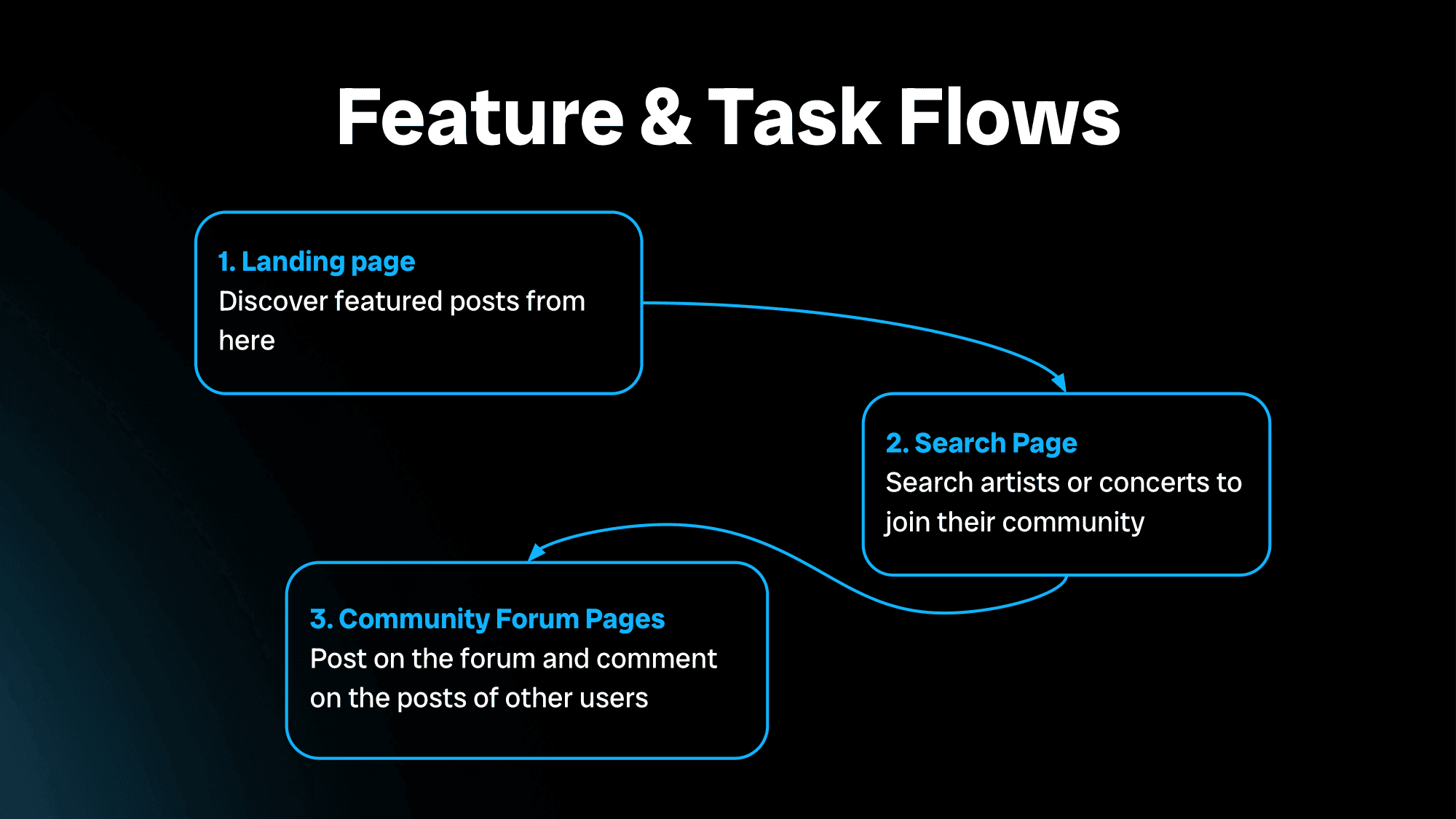
Ideation
Join and participate in music communities
We encourage exploring and joining groups based on your favorite artists, genres, or upcoming events.
Event-specific groups allow you to connect before and after a concert or festival.
Log and share music experiences
You can create personal logs of concerts, festivals, and other live music experiences.
Chat with others in group-specific forums
We emphasize sharing music topics and experiences.
Community engagement tools help users find new events, share recommendations, and form connections.
Below are some of our initial prototypes in interesting states:
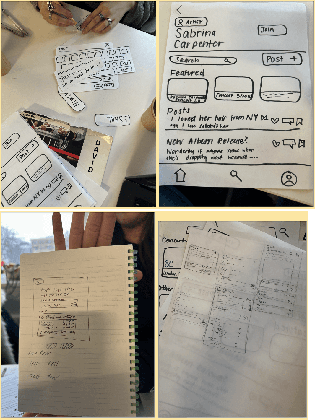
User Research
Peer Feedback:
Acting out interactions with tactile paper components gave us a deeper understanding of our app's flow and highlighted the subtle issues in usability that might've gone unnoticed otherwise. It was especially helpful to observe how users physically navigated the prototype, revealing both affordances and disaffordances in our design.
Issues Identified:
Home page communities section is quite unclear and all three of our test users were confused by it, as they made unpredicted decisions
Improvement in the home page:
More clarification in the “communities” section - change to “your communities”
Emphasis on a plus button in the communities section, to denote that you can add a community - More clarification on posts thread
TA Feedback
Overall, our TA was worried that our features were too intertwined with each other; thus we took this into consideration and made the interface have three main features one can execute, and two main features to either post on a main channel and to a discussion thread.
Revised Interface Changes
We updated the wording on the homepage from “communities” to “your communities” to clarify that this section reflects the user's existing communities.
We implemented adding a plus icon to the communities section to join communities due to some feedback from a User Testing session.
Adding a recently searched section to our search is one of the key features about implementing a search. It allows users to quickly revisit previous searches, improving navigation and efficiency. We felt it would be useful to include this alongside recommended results for a more seamless search experience.
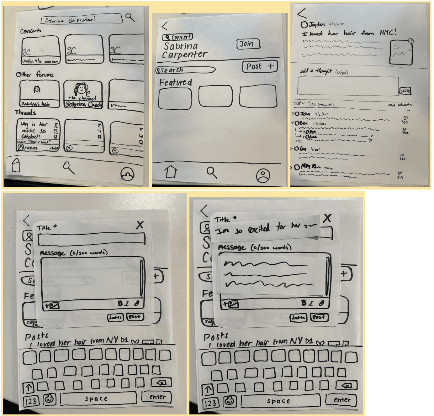
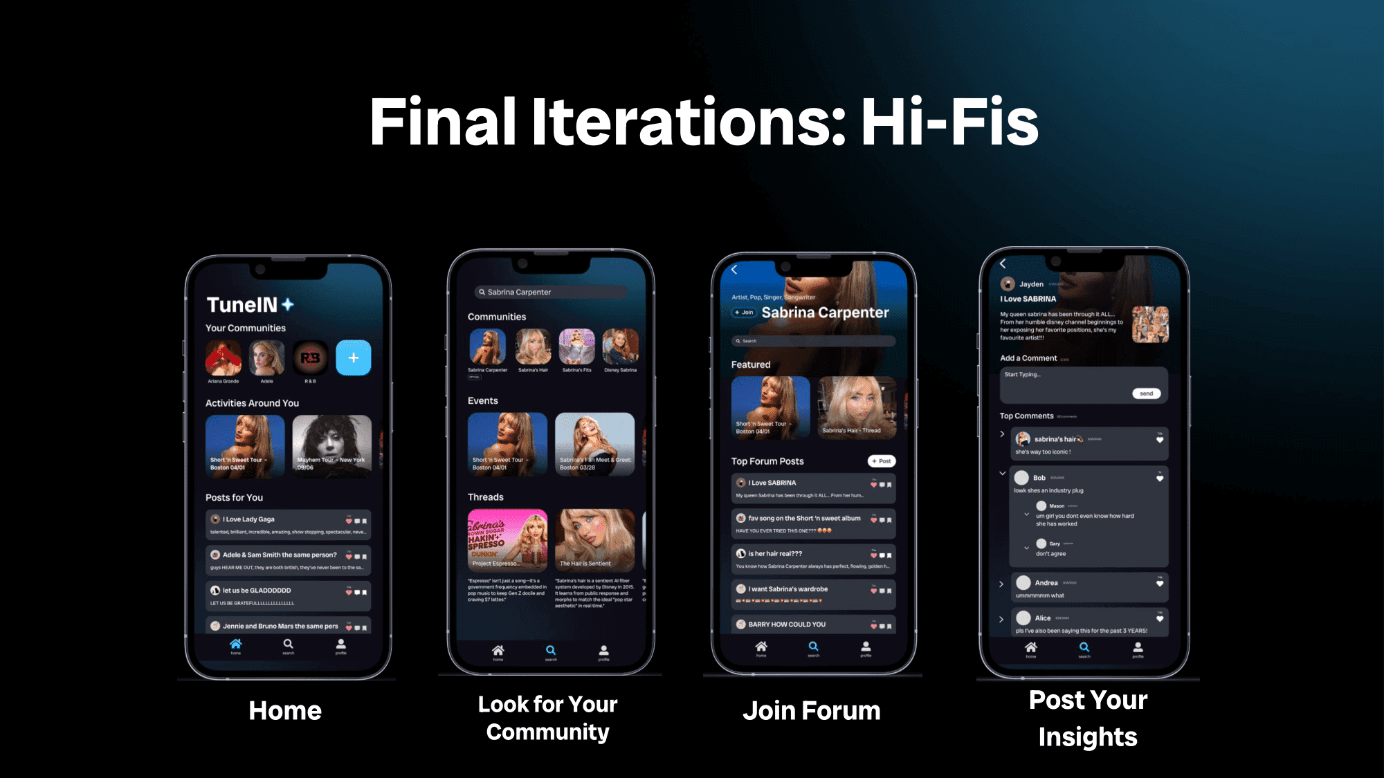
Lo-Fis

Final Flow and Demo
Value Proposition
TuneIN fills a gap in the market for experiencing connections and creating authentic discussions surrounding music.
Compared to other forum based apps, TuneIN emphasizes combining in-person music experiences with virtual community building together.
Key Insights
Through the four weeks of ideating and producing our final application, we gained key takeaways:
Extensive user testing allowed us to better optimize the application and identify new pain points.
Iterations through paper prototyping was valuable in order to visualize user flow and considering element hierarchy.
Feedback from multiple people, not just students and peers guided us to design for different perspectives and use cases.
Future steps
More features that intersect virtual and physical experiences in the future, such as exclusive temporary features for TuneIN users to partnering with music and event providers to build a system that match users together to increase personal connections.