User Interface and Experience Design | Fall 2025
ZOR!

Overview
Recently, I had the opportunity to join a student-run health tech start-up, funded by the Sherman Center at Northeastern University. ZOR! is revolutionizing epilepsy management and care for patients and caregivers via non-invasive, predictive technologies. At my time at ZOR!, I worked on the app interface, brand design, and marketing for the startup.
Approach
Collaborating primarily in the UI team, we came in with prior designs made from Scout, a design club at Northeastern. Over time we had new constraints and thus had an entire design audit, continued user research, rebuilt our design system from the ground up, and added additional features.
We also worked closely with students in the healthcare field, focusing on integrating data science and health into the app's core.
My Roles
Head of User Experience
UI Designer
Brand Designer
Deliverables
Final App Prototype and Mockup
Brand Design and Design System elements
Team Members
Annika Kim, Lucy Liu
September 2025 - Present
User Research / Defining Problem Space
1 in 26 people are will develop Epilepsy in their lifetime, with ~50 million people affected with Epilepsy worldwide. (Epilepsy Foundation)
70% of people with epilepsy can get seizures controlled with seizure medicine. (Epilepsy Foundation)
Coming into ZOR!, I had references from previous contract designers and their wireframes of certain screens on the app.

I noticed a big disparity in ZOR!'s current designs at the time, and our values of health insight and availability for everyone, thus I further defined my problem space through user research.
Expert interviews
We heavily referenced feedback of our current app gathered from
2 Epilepsy researchers
3 clinicians
5 caregivers
1 professor of Neurology at Stanford
CEO and CSO of the Dravet Syndrome Foundation
3 people living with epilepsy
Through these interviews, we primarily focused on implementing seizure tracking and data insight features into our app.
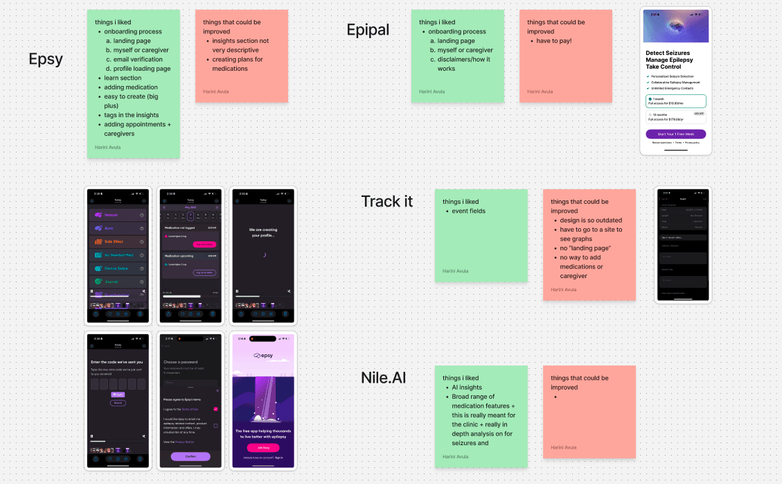
Competitor Analysis
We dove into our competitors and researched apps catered for Epilepsy, seizures, medication tracking, and health data.
Key takeaways:
We found inspiration from the Apple health app in visualizing our data. Their simple interface and straightforward insights were key in the user experience we wanted to elicit.
We referenced other apps in our field and jotted down bright and pain points attached to each.
What we found
After interviewing/researching, we defined key points that would be implemented:
Visual data representations are paramount! Use visual diagrams instead of tables to represent data
Implement 2-4 hour benchmarks when visualizing data
Have visuals to correlate seizure data with heart rate
Design edge cases for data visualizations
Simplify onboarding process to maximize retention
A whole lotta data…
Working with front-end, back-end, and health teams, we established an extensive document of seizure and medical related terms to implement and keep track of while designing and developing the verbage for our app.
From the info buttons above each question and data insights, the "Data Bible" proved to be a necessity in the development of our app interface.

Defining our Target Audience
Through the previous research, we defined our target audience by:
People living with epilepsy
Their caregivers who are seeking to improve epilepsy management through a digital mobile application and has iPhone
Problem Statement
How can we update our designs to optimize the simplicity of user experience for users, integrating health statistics, data insights, and medication management?
Designing Solution
Initial UI ideation and sketches for the data visualization feature (GoodNotes)


Initial sketches of survey and home pages

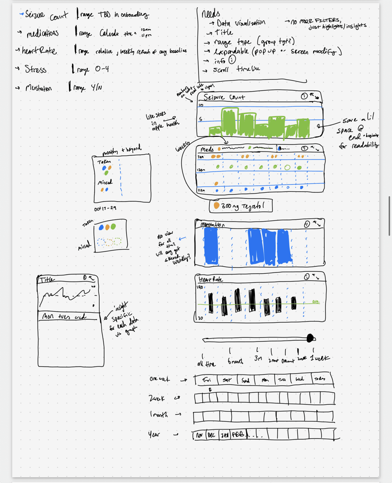
Initial sketches of data visualizations for ZOR!
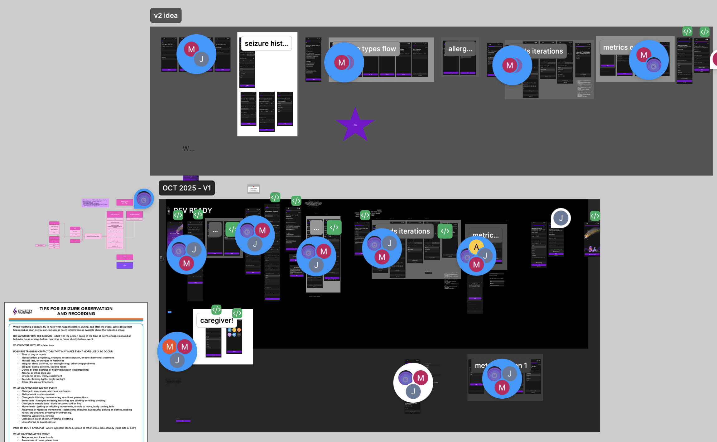
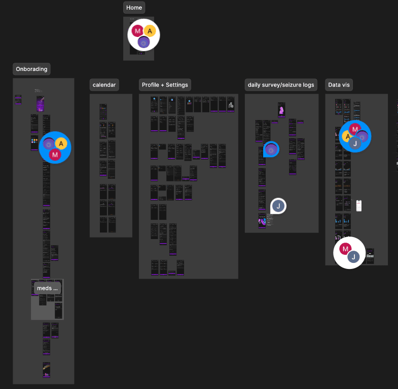
Working with my UI team, I delegated tasks to iterate on the design system and pages for ZOR!, making sure to save any past iterations.
Along with re-organizing the Figma file to help developers, I worked on developing the design system, and the Onboarding, Home, and Data Visualization pages.

I created a user flow map prior to the final prototype.
We focused a lot on the Onboarding flow, taking suggestions from user research to simplify the process as much as possible, which was challenging as we required users' medical history with seizures.

I made and saved all iterations, referencing real world examples, meeting with the founder, student health experts, and design professors at Northeastern in critique sessions.
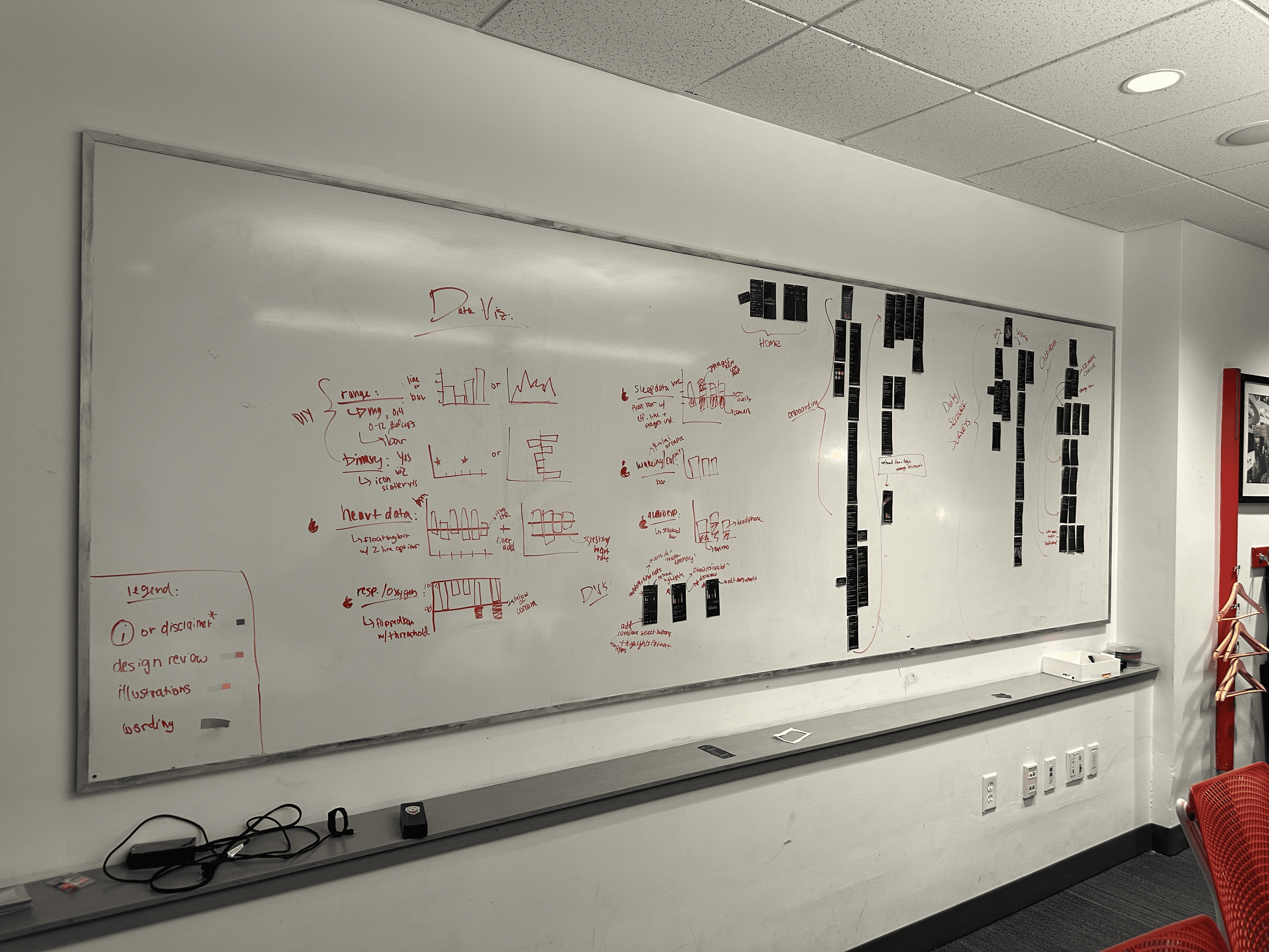
Below is a screenshot of the Figma file for the Onboarding flow prototype.
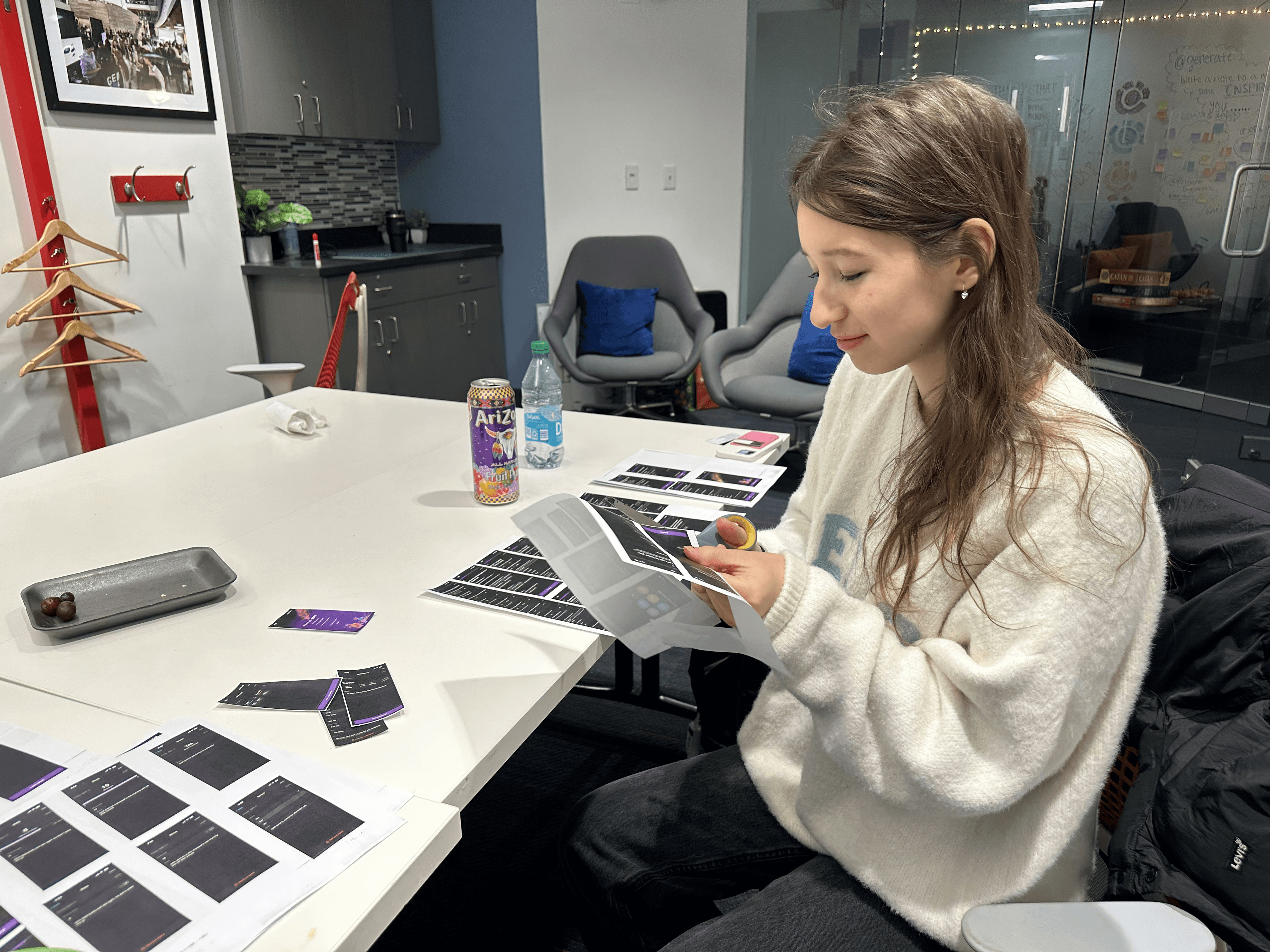
Before we finalized the designs for handoff to the front-end team, I hosted a print-out review session. We printed every page design for the ZOR! app, laid out the flow on whiteboards, and critiqued and observed any anomalies / design changes needed.
This process was immensely helpful (and super fun!) to point out all the small errors and any pages that needed to be removed / added. Seeing a tactile version of my designs was rewarding and insightful.


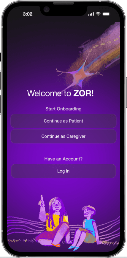
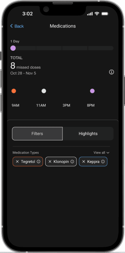
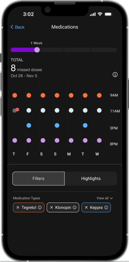
Prototype (2025)
Below are highlighted screens from the ZOR! final prototype:
Initial and Home Pages

Data Visualization pages


Calendar Page / Seizure Survey Page

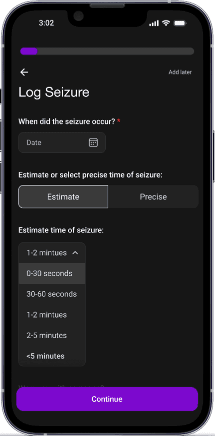
An overview of the ZOR! final prototype - all pages for the patient view.
Takeaways / Next Steps
Over the past semesters, ZOR! defined my love for user experience and interaction design. I found I work most passionately in a fast-paced environment, learning from other designers and those not in my field of expertise.
This project pushed me to discover new ways to design for a health-tech product, something I've never done before.
Building a product from the ground up was exciting; I found myself motivated by how much impact I was making to the final prototype and through the incredible people I've met through this journey.


Moving forward, I will continue to define product decisions through ongoing user research, using feedback to guide my designs and inform iteration as I prepare to deploy a working prototype to the Apple App Store in Q2 2026.
Key design changes (redesign of our data visualization pages to simplify the overall experience, updates to the onboarding flow to optimize retention) were synthesized from user interviews and prior research findings. These insights will continue to be tested and refined to ensure our solutions remain grounded in real user needs!